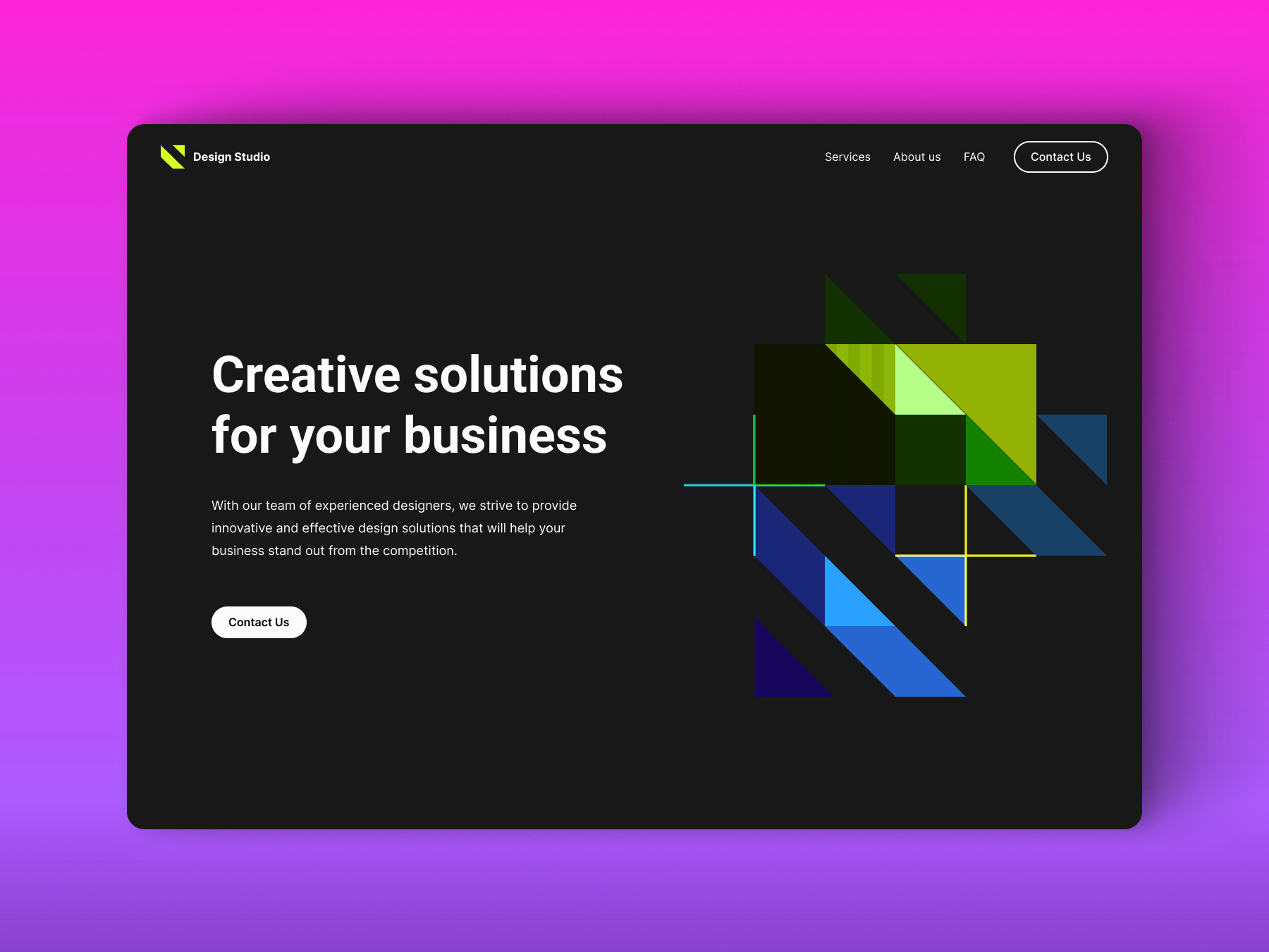

I am pleased to share my recent project: a landing page for a company that assists tech startups in designing and implementing effective go-to-market strategies. The main text for the site was provided by the client.
Before diving into the design, I conducted a thorough marketing analysis:
1. Target Audience: The target audience is primarily startups. I focused on understanding their specific needs and aspirations during the development phase.
2. Competitor Analysis: I researched the startup development niche, analyzing competitors to identify their strengths and weaknesses, which informed our differentiation strategy.

Design Solution:
1. Clean and Modern Design: The website features a contemporary and professional look while remaining user-friendly.
2. Clear Navigation: The site offers clear and intuitive navigation, ensuring easy access to the main menu and desired information.
3. Testimonials: Client testimonials are included to showcase expertise and build trust.
4. Effective Call-to-Actions (CTAs): Strategically placed CTAs, such as "Contact us" and "Work with us," encourage visitor engagement.
5. User-Friendly Contact Form: A straightforward contact form is integrated to streamline the inquiry process and minimize user effort.

About color palette
The primary colors of this site are #1B554E and #EE7030. This combination can have specific psychological effects on users:
#1B554E - Dark Green - Calmness and Stability: Dark green conveys calmness and stability, reassuring startup founders of the company's reliability.
#EE7030 - Bright Orange - Energy and Enthusiasm: Bright orange symbolizes energy and enthusiasm, reflecting innovation, creativity, and the forward-thinking spirit of startups.
Combined Effect for Startups:
The blend of dark green and bright orange creates a balanced psychological impact:
- Trust and Innovation: Dark green instills trust and dependability, while bright orange adds a dynamic and creative touch. This suggests that the company is both reliable and innovative, ready to support startups in their ventures.
- Creativity and Forward-Thinking: Bright orange highlights the company's innovative approach, suggesting readiness to support startups in their endeavors.
- Creativity and Forward-Thinking: Bright orange highlights the company's innovative approach, suggesting readiness to support startups in their endeavors.
- Attention-Grabbing: The contrast between dark green and bright orange is attention-grabbing, drawing users' focus to important elements on the website.
Sources:

These customized strategies and design solutions for startups aim to effectively connect with the target audience and enhance user experience on the landing page.
Thank you for watching!
I would be happy to create a design for your site!